40's & 50's fabric
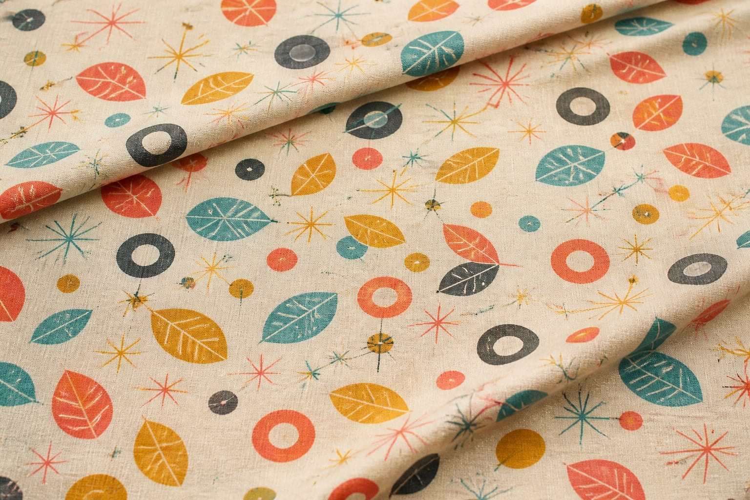
“Here you will find our selection of Forties and Fifties themed fabrics” introduced the 2009 category. A long image grid followed, moving through florals, fruit, novelty scenes, transportation, kitchen imagery, dots, and other period-inspired subjects.
- Allentown — fresh
- Alphabet Stencils — grey/pink
- Aunt Grace Flower Vase
- Aunt Grace School September
- Aunt Grace Swing Dance
- Baby Dear Bouquet
- Baby Face
- Beach Umbrellas
- Cherry Stripe — blue
- Cherry Stripe — pink
- Classic Fruit Tablecloth — natural
- Cool Cats — red
- Cowboy Barkcloth — natural
- Do it Yourself — multi
- Eiffel Tower
- Fruity Kitchen Tile Oilcloth
- Happy Campers Plaid — lake
- Japanese Grocery — bubblegum
- Kitchen World — red and blue
- Martini Olives
- Nifty 50's
- Oodles of Poodles
- Retro Airplanes
- Swing Band
The visual guide below describes the category's period language without claiming every item was manufactured during the decades named in the heading.
Period style is not the same as date
A print may evoke an era through scale, shape, color, and rhythm. That resemblance is useful for description, yet it cannot establish when the cloth was manufactured. Reproductions, later revivals, and designs that simply share formal traits may all look convincingly period-specific. Labels, documented provenance, dated photographs, manufacturer records, and technical analysis carry more historical weight than appearance alone.
The V&A overview of post-war textiles traces a period that moved through restrained utility, small geometric repeats, atomic imagery, organic abstraction, and later bolder color and scale. Its chronology shows why there is no single fifties look. Several design languages coexisted and developed rapidly.
Small repeats and lively intervals
Many fifties-inspired prints use motifs small enough to form an even field. Dots, rings, starbursts, leaves, checks, kitchen forms, and simplified animals can sit in straight rows or shift in half-drop arrangements. Open space between units gives the eye a pause; tightly packed motifs create a continuous texture. An irregular line or slightly varied form can keep a regular repeat from feeling mechanical.
To analyze a fragment, mark one feature mentally and locate its return in both directions. Then notice how the eye moves between repeats. A diagonal path adds energy, while a stable grid feels controlled. The method is explained more fully in the retro fabric repeat guide.
Color relationships
Fifties-inspired palettes are often remembered as cheerful, but brightness is only one possibility. Warm coral, leaf green, mustard, turquoise, soft pink, gray, cream, and dark brown can appear in very different proportions. Muted grounds may support one crisp accent. Black or deep charcoal can sharpen pastel hues. A limited three-color scheme often feels more period-conscious than a broad rainbow because each color has a clear structural job.
Value matters as much as hue. Photographing a pattern in grayscale reveals whether its shapes depend on light-dark contrast or mostly on color difference. If every hue converts to a similar gray, the print will read softly from a distance. The focused canary yellow color study explores how a saturated solid can either intensify or steady a printed palette.
Domestic scale and sewing context
Small and medium repeats adapt readily to compact panels because several complete units remain visible. Larger motifs may work as isolated focal areas but require careful placement around seams and folds. A paper frame matching the intended panel size helps reveal whether the design will read as scattered detail, continuous texture, or a cropped scene.
Directional motifs require consistent orientation. Rounded non-directional forms are more forgiving, while objects with an obvious top can appear inverted if pieces rotate. There is no universal best scale. The decision depends on viewing distance, panel dimensions, seam placement, and whether the pattern should lead or support the composition.
Distinguish reproduction from wear
A faded palette does not prove age. Printing choices can simulate softness, while true wear may be uneven at folds, edges, and exposed areas. Likewise, small slubs or registration shifts may reflect a production method, later abrasion, or an intentionally irregular design. Record where a feature appears and whether it repeats before interpreting it.
Useful documentation includes the full width if known, selvage details without assuming they identify a date, front and reverse views, measurements, repeat dimensions, and notes about light conditions. Avoid permanent labels on the textile. The National Park Service textile-care guidance provides general principles for clean, cool, dry, dark storage and the careful support of folds.
Look for a family of cues
A convincing period-inspired reading emerges from several features working together: repeat structure, motif simplification, palette, scale, ground, and material behavior. No single starburst, turquoise accent, or novelty subject proves a decade. Describing the family of cues produces a richer and more honest account than assigning a date from style alone.