Canary Yellow Cotton: A Color and Material Study
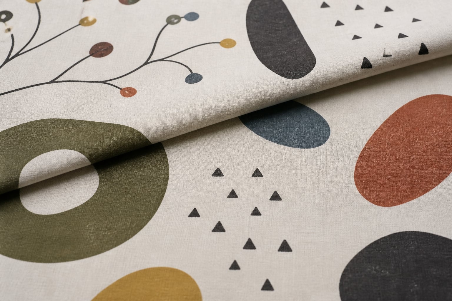
Canary yellow cotton brings a high-energy hue into fabric combinations. Without a specific brand, weight, weave, width, or finish, the useful focus is color: how a strong yellow changes beside cream, orange, olive, brown, blue, and patterned cloth.
What canary yellow communicates
Canary yellow generally describes a clear, saturated yellow rather than a muted ochre or orange-leaning mustard. Even that description is relative. Under warm light it may appear softer and more golden; under cool light it can seem sharper or slightly green. Neighboring colors also alter perception. A yellow beside white often looks more intense, while the same cloth beside orange may appear cooler.
Digital images cannot settle the question. Camera exposure, white balance, compression, screen settings, and surrounding interface colors all affect a swatch. A useful record includes a neutral reference, consistent diffuse light, and notes about the viewing conditions. These steps document appearance; they do not replace instrumental color measurement.
Build a palette by value and proportion
Strong yellow can act as a large field, a narrow separator, or a tiny accent. Its proportion matters. Across a broad surface it dominates the composition and reflects color onto nearby materials. In small amounts it creates points of emphasis. Pairing it with cream lowers contrast, while charcoal or deep blue creates a more forceful light-dark boundary. Adjacent yellow-green and orange hues produce a warmer, continuous sequence.
Printed fabric rarely needs an exact hue match. A coordinating solid can repeat a minor accent, bridge two colors, or provide visual rest. Folding the solid to approximate its eventual area is more revealing than judging two full-width pieces side by side. The general retro fabrics guide explains ground, support, and accent roles within a palette.
Cotton is a fiber, not a complete specification
The word cotton identifies fiber content only when supported by reliable evidence; it does not describe weight, weave, finish, shrinkage, colorfastness, or suitability. Plain weaves can range from very light to substantial. Brushing changes surface and hand. Coatings alter reflection and resistance. A photograph of a solid color reveals almost none of these properties.
For an unidentified piece, record apparent weave, opacity against light, surface texture, drape, and any labels or known provenance. Avoid destructive fiber tests on historical material. If the cloth is contemporary and documented, follow its established care information. If it is older or uncertain, conservative handling is the safer starting point.
Construction and visual emphasis
A solid can frame a motif, separate busy repeats, or make small components more legible. Narrow yellow bands create rhythm without occupying much area. Larger panels turn seams and topstitching into prominent graphic lines because there is no printed motif to distract the eye. Texture, grain, and pressing quality therefore become especially visible.
The same color can connect very different pattern families. It might lift the dark geometry of a mid-century modern print, echo the sunlit accents of a tropical composition, or punctuate the earthy ground of a western motif. The decision works best when based on value and proportion rather than a color name alone.
Light, folds, and storage
Bright color is vulnerable to cumulative light exposure, though the rate and type of change depend on dye, fiber, finish, and environment. Keep older textiles away from sustained bright light, with clean support and no sharp folds. Do not assume that a vivid appearance means a dye is stable or that a pale area can be cleaned back to its original tone.
The Smithsonian Museum Conservation Institute overview of textile conservation frames care around examination, documentation, preventive measures, treatment, and research. The National Park Service textile handbook adds museum-oriented handling principles. These are general references; a conservator should assess fragile, valuable, or unusually finished cloth.
A precise record without false precision
Canary yellow is most useful as an observed color relationship—described under known light, compared by value and proportion, and considered alongside material behavior that a photograph cannot prove. Its effect changes with ground, neighboring hue, surface, weave, and the amount of yellow in the composition.